After graduating from college with a degree in commercial art, I still had a lot to learn about fine art painting. Around that time, I bought the brand new book Alla Prima by Richard Schmid. In the book, Schmid lists the palette colors he most often uses. I adopted most of his list and set out to learn how they all worked together. Black wasn’t a color he listed, so I learned to make it by mixing other tube colors together — a valuable lesson. (By the way, chime in below if you’ve experienced the joy of making Schmid’s color charts. I think I spent two months on mine.)
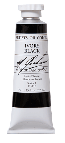
A few years later, I had the opportunity to watch a live painting demonstration by Scott Burdick. He masterfully painted a portrait from a model outdoors using a limited palette. It was the first time I had ever seen anyone paint with a four-color palette. You may have heard of the four-color “Zorn palette” named for Swedish artist Anders Zorn. Scott used a similar palette that day: Titanium White, Cadmium Yellow, Cadmium Red and Ivory Black.
Scott’s painting blew me away. I had no idea of the range that could be achieved with so few colors, especially with one being black. Afterwards, I set out to experiment with the Zorn palette and other limited palettes myself. The pictured painting is one that I did from life using the four-color palette that Scott used.
I soon added Ivory Black to my regular palette after seeing the range of colors I could make with it. I continue to use it for studio painting as well as plein air painting.
I think the only danger to be aware of is that any color can become a “crutch” if not used properly. An artist could easily use black as a lazy choice for darkening colors in every situation rather than simply using it as a dark color that is cool in color temperature. (An early crutch of mine was Sap Green. Since it’s such a normal-looking green, I used it to make all the greens in my paintings and didn’t really analyze and mix the exact green I needed. So I replaced it on my palette with Viridian — a much more unusual green which usually requires mixing with other colors to make the exact green I need.)
Were any of you taught to avoid using black? Have you rebelled and used it anyway?
