
Quick review of your color theory lessons: Colors opposite each other on the color wheel can be mixed together to reduce each other’s color intensity, creating grays. (The addition of white will make the graying more apparent.)
Why is complementary color mixing important, you ask? Because we can mix more accurate, clean and exciting grays than when mixing only black and white.
It’s helpful to realize that many (perhaps most) of the colors we see in our subjects are muted. Grayed. We rarely apply a pure color straight out of the tube directly onto a painting. Our colors almost always have to be grayed to some extent in order to accurately match the colors of nature. And the grayed colors we see aren’t made up of just black and white. They have specific color characteristics. (One reason I think many instructors have taught to avoid using black altogether.) Fortunately, each complementary mixture gives us a uniquely colored gray, so we have a vast number of gray mixtures at our disposal for any situation.
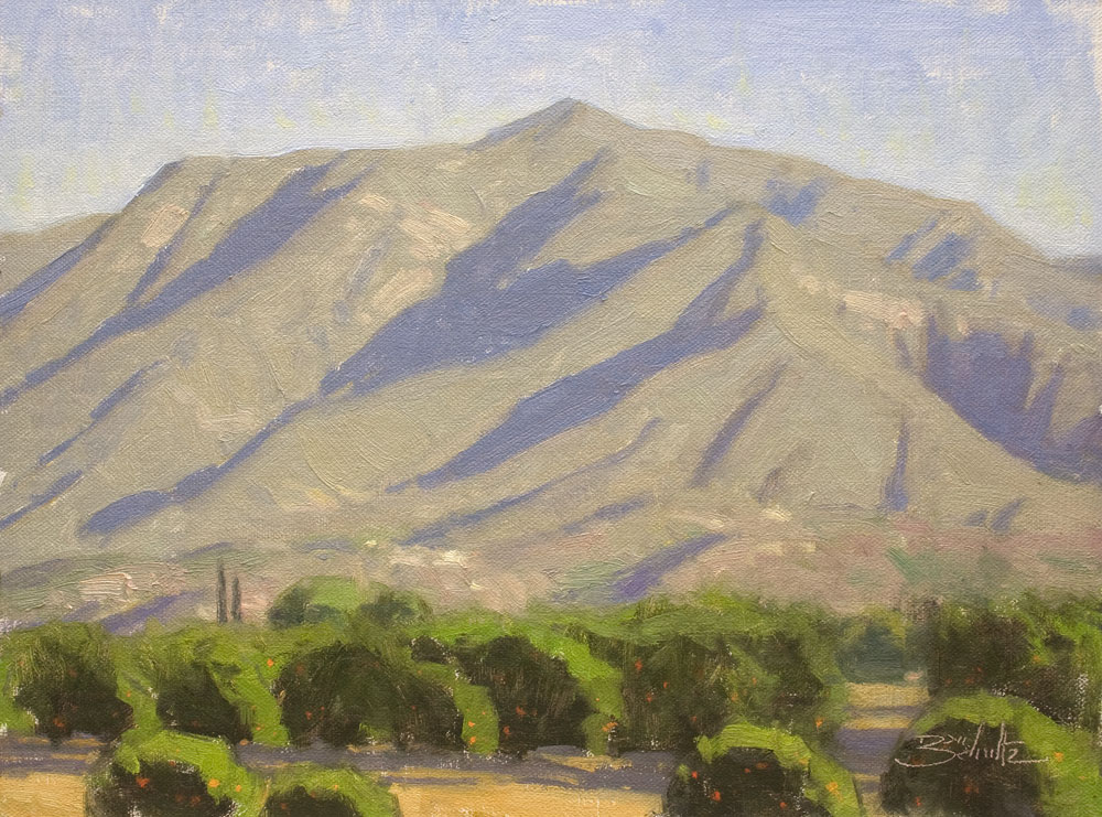
As you practice over time, you’ll find that certain complementary mixtures are perfect for mixing specific colors you see in your subject. A practical example from my plein air excursions: I’ve found that a red / green complementary mixture is often well-suited for matching the color of the sunlit areas on the mountains here in Southern California. (See my pictured painting, Ojai Morning Light.) Anthraquinone Red (or Permanent Alizarin Crimson) + Viridian Green + Titanium White. Sometimes a slight bit of Yellow Ochre is also necessary to push the gray to the exact right color, but the foundation is the red / green complementary mixture. By the way, if you’re saying to yourself, “Dan’s mountains still look pretty green to me,” be sure to compare visually with the greens in the foreground trees and you’ll see that the mountain color is much, much grayer.
While you’ll want to avoid becoming too formulaic in your color mixing, over time you’ll be able to recognize certain grays you see in your subject as being made up of specific complementary mixtures. Just like my red / green mountains. Then you’ll understand even more how much gray matters.
Write your awesome label here.