Color

Esther Hi'ilani Candari
The way our eyes interpret light the light being produced or reflected around us. 
Color is all about light. Or, more specifically, how wavelengths of light are understood by our eyes. When it comes to art, we can work with color in two ways. One, with technology. Two, by using natural or chemical compounds that reflect the light (or color) that we want. We don’t think of color in terms of chemical compounds reflecting light, however. We think of color in terms of pigments: paint tubes, bottles of ink, oil pastels, or markers.

However, you think of color, it's important to remember

projected color mixes differently than pigments. The full spectrum of colored light will combine to create white. Whereas the full spectrum of pigments will mix together to create some shade of grey, black, or brown. When you hear the term Color Theory, know that it is all about pigments (aka paints, inks, and pastels).
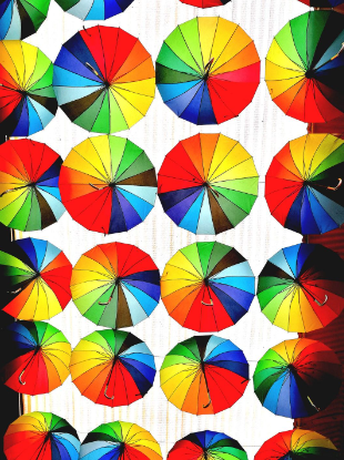
The most basic components of color are the primary colors. Primary colors are the root of all other colors and can not be created by mixing other colors together. They are red, yellow, and blue. 

If you mix equal parts of two primary colors you get a secondary color. The secondary colors are orange, purple, and green.

Tertiary colors are made by mixing equal parts of one secondary color and the adjacent primary color, such as red and orange to create red-orange. 
When arranged in a circle this progression of colors is known as the color wheel.

Saturation

Saturation is the intensity of a color. In physical terms it is how much pigment, or pure color, is in a mixture.
Saturation is different than value. A color can be both light and dark value and still be high saturation.
One way you can think of it is how loud is the volume turned up on a color, or would the color make it into an 80's costume party.

Warm vs. Cool

Another way to divide color is into warm and cool colors. Warm colors lean yellow red, cool colors lean blue. This spectrum is called color temperature.
Temperature, like many things in art, is relative and contextual. If you place a neutral color next to a warm color it will appear cool. If you place the same neutral color next to a cool color it will appear warm. 

Color Schemes

Themes are specific sets of colors that combine well. These sets are determined by dividing up the color wheel in a certain pattern.
Two common themes are complimentary and analogous.
Complimentary schemes are made up of two colors directly across from each other on the color wheel.
Analogous themes are three adjacent colors on the color wheel.

Write your awesome label here.

"All colors are the friends of their neighbors and the lovers of their opposites."  

- Marc Chagall

Apply Your New Knowledge